
Visitors arrive at your site with a built-in skepticism. Every claim you make, every promise you offer, is met with a silent “Prove it!”
Your website’s primary job is not just to inform, but to systematically dismantle that doubt. A high-trust website functions as a continuous, convincing argument for your credibility, built to guide a visitor from suspicion to confidence.
This argument is constructed from three core layers:
- Intentional design that subcommunicates stability
- Content that demonstrates expertise without arrogance
- Tangible proof that validates your claims
When these layers align, they remove friction and create a clear path for a visitor to become a lead.
Let’s examine the specific, working components of each layer.
Clean Design That Lets Content Breathe
A decluttered design helps visitors feel in control. When pages feel calm and organized, people understand where to look and what to do next. That sense of ease builds confidence. Design shapes first impressions, and those impressions stick.
Research and real-world behavior show that roughly half of users judge a business’s credibility mainly on its website design. That makes design a long-term brand decision, not a cosmetic one. What your site feels like today affects how trustworthy your brand feels tomorrow.
Clean design reduces friction. Fewer elements mean fewer decisions for visitors to make. Clear spacing, readable text, and obvious priorities help people scan, process, and move forward. When everything competes for attention, nothing feels important. When key elements stand apart, they feel intentional and reliable.
To do this well:
- Remove anything that doesn’t support a clear goal.
- Limit the number of fonts and colors.
- Give sections enough space so they don’t blur together.
- Make headlines easy to spot and actions easy to find.
- Keep navigation simple and predictable.
- Resist the urge to explain everything at once. A focused page earns more trust than a crowded one.
PandaDoc is a strong example of this approach. They operate in the business document space, helping teams create, approve, and sign documents online.
Their website relies heavily on white space, with only essential elements shown at a time. Each section stands on its own, with clear boundaries and purpose. Content feels easy to follow because nothing fights for attention.
The result is a browsing experience that feels structured and confident, which matches the seriousness of their product and reinforces trust at every step.
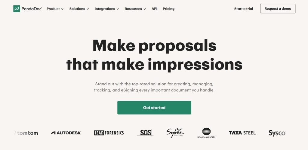
Source: pandadoc.com
Strategic Social Proof That Reduces Hesitation
Social proof works because visitors look for reassurance before they commit. When people see that others have already chosen a product or service, uncertainty drops. It answers a quiet but important question: “Can this business deliver what it promises?”
Strong social proof shortens the decision cycle and builds confidence without extra explanation. It shows credibility through evidence, not claims.
Effective social proof feels relevant and well-placed. Random testimonials buried at the bottom of a page won’t carry much weight. The goal is to support key decision points.
To do this well:
- Place proof near CTAs, pricing sections, and feature explanations.
- Use real names, roles, and companies whenever possible. Specific feedback beats vague praise.
- Numbers also help when they’re clear and honest. Client counts, review totals, and ratings give visitors quick signals they can trust.
- Variety matters too. Relying on one type of proof limits impact.
- Combine customer quotes with recognizable logos, third-party ratings, and security or compliance badges where they make sense.
- Keep the design clean, so the proof stands out rather than blending into the page.
- Avoid overloading a section. Each proof element should earn its spot by supporting the visitor’s next step.
DialMyCalls shows how this comes together. They provide mass notification services for organizations that need to reach people fast.
On the landing page for their mass notification system, social proof appears exactly where visitors expect reassurance. Well-known client logos sit near the top. Testimonials reinforce use cases further down the page. Third-party ratings and review counts add outside validation, while trust badges support reliability and security.
Each element reinforces the same message at different moments, helping visitors feel confident enough to act.
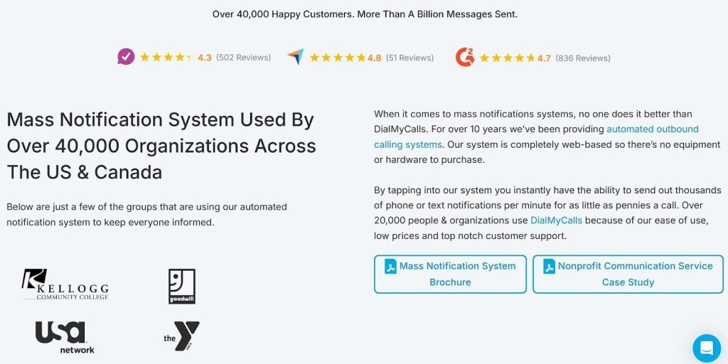
Source: dialmycalls.com
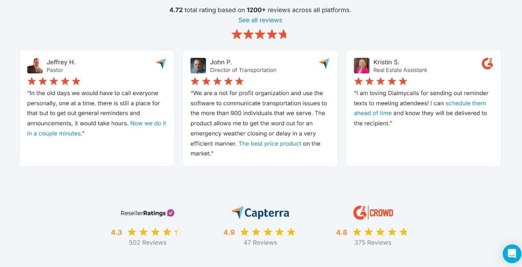
Source: dialmycalls.com
Interactive Content That Builds Confidence Through Action
Interactive content earns attention because it asks visitors to participate. Instead of reading claims, people test ideas for themselves. That shift matters.
Interactive experiences see about a 94% higher lift in views compared to static content, largely because users stay longer and engage with purpose. Engagement builds familiarity, and familiarity supports trust.
This type of content works best when it solves a real problem quickly. Calculators, quizzes, assessments, and guided tools help visitors get value before they commit. When someone inputs their own data and receives a useful result, the experience feels personal and credible. It also positions the business as helpful and informed rather than pushy.
To do this well:
- Come up with one focused question your audience wants answered.
- Keep the interaction short and easy.
- Avoid unnecessary fields and steps.
- Explain what the user will get and why it matters before they start.
- Make results clear and actionable.
- Tie the outcome to your service naturally, so the next step feels logical rather than forced. Good interactive content supports decisions instead of distracting from them.
R.E. Cost Seg offers a clear example. They provide cost segregation services for real estate owners who want to optimize depreciation and tax savings.
On their site, they feature a free real estate depreciation calculator built for real estate investors. Users enter basic property details and receive an estimate of potential depreciation savings, a key financial factor in property ownership.
The tool stays simple, relevant, and fast. It delivers immediate value while clearly connecting to the services R.E. Cost Seg provides. Visitors leave with insight and a reason to continue the conversation.
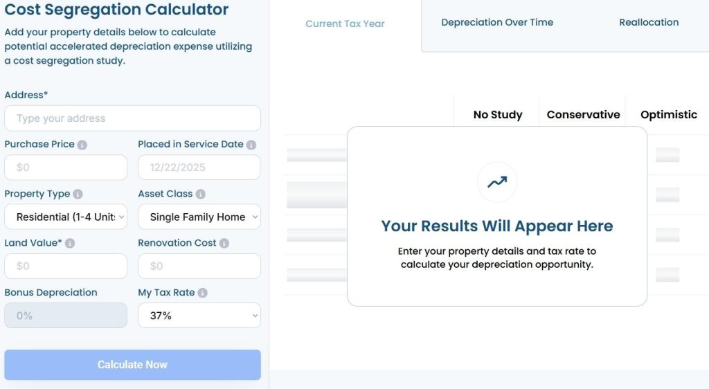
Source: recostseg.com
Demo Videos That Show Real Solutions
Video builds trust because it removes guesswork. Visitors don’t have to imagine how a product works or what results to expect. They can see it.
That matters when attention is limited and skepticism runs high. In fact, 63% of customers say they prefer watching a short video when learning about a product or service. Video meets people where they are and helps them decide faster.
The most effective videos focus on outcomes, not hype. They show how a product solves a real problem in a real situation. When viewers understand how something works within seconds, confidence grows.
To do this right:
- Lead with the core benefit.
- Show the product in use as early as possible.
- Short works best. Keep it under two minutes and cut anything that doesn’t support the main point.
- Aim for clarity over polish. A clear walkthrough beats a cinematic production that avoids specifics.
- Use plain language and on-screen cues so viewers can follow along without sound.
- Place the video where decisions start, not buried on a secondary page.
- Pair it with a clear next step so visitors know what to do once they’ve watched.
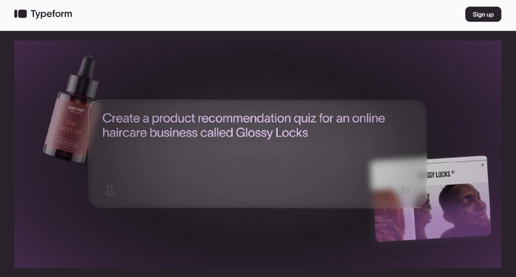
Typeform uses this approach well. They offer a platform for building interactive online forms and surveys.
Right below their homepage header, they feature a short product video that highlights a key capability: their AI-powered form generator. Instead of explaining it through text alone, the video shows how quickly a form comes together and how natural the experience feels.
The proof sits front and center. Visitors see the feature, understand its value, and connect it directly to their own use cases. That clarity helps turn curiosity into action.
Source: typeform.com
Enticing CTAs That Prompt Action
CTAs shape the moment when interest turns into movement. A strong CTA gives visitors a clear reason to click now instead of later. It reduces friction by answering what happens next and why it’s worth doing.
When CTAs feel vague or generic, people pause. When they feel specific and timely, people act.
Effective CTAs focus on value and timing. They tell visitors what they’ll get and frame it in a way that feels relevant to their situation.
To do this well:
- Start with one primary action per page.
- Write CTAs that reflect the outcome, not the feature.
- Keep them honest and easy to scan. Clarity matters more than cleverness.
- Pair them with short microcopy that explains the benefit, removes doubt, or highlights urgency. Small details can increase impact by adding context or reassurance without adding pressure.
- Place CTAs where users finish reading a key section or feel ready to decide.
- Avoid hiding them behind generic phrases or repeating the same wording everywhere.
- Each CTA should match the intent of the page it sits on.
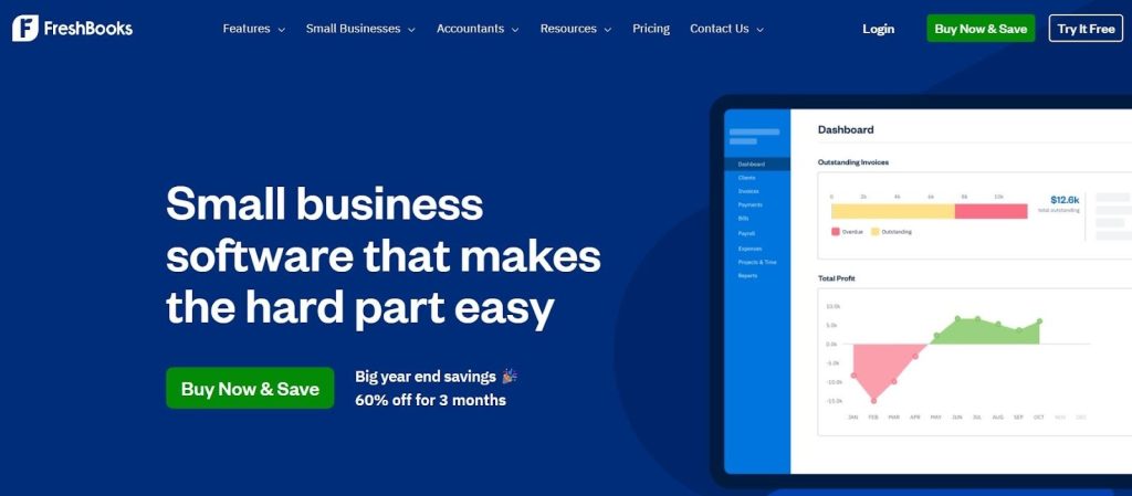
FreshBooks offers a clear example. They provide cloud-based accounting software built for small business owners and freelancers.
On their homepage, the primary CTA stands out right away with the message “Buy Now & Save.”
However, the button doesn’t stand alone. Supporting microcopy underneath reads “Big year end savings – 60% off for 3 months.” That added detail sharpens the offer and explains why acting now makes sense.
The CTA feels direct, relevant, and timely, which helps visitors move forward with confidence instead of hesitation.
Source: freshbooks.com
Final Thoughts
High-trust websites don’t rely on persuasion tricks. They focus on removing doubt at every step.
Clear design helps visitors stay oriented. Social proof answers unspoken concerns. Interactive content creates value before commitment. Video shows how solutions work in real time. Well-written CTAs guide the final decision without pressure.
Each element plays a role, but trust comes from how they work together. When pages feel intentional, useful, and credible, visitors don’t need convincing. They feel confident enough to act.
So, audit your website through the lens of trust. Look for points where users might hesitate, question, or disengage. Then adjust design, content, and proof to support clarity and confidence.
When trust becomes the foundation, leads follow naturally.